If your home page cannot explain what the site does, who it is for, and what the visitor should do next, it is not doing its job. It is just taking up bandwidth in a flattering font.
By Felix Rowan · June 23, 2026
People usually ask the same four questions when they land on a home page and do not immediately understand it: What is this place? Is it for me? Can I trust it? What happens if I click the obvious button? If the page answers those questions fast, it earns attention. If it does not, visitors leave and pretend they were “just browsing,” which is the polite version of an exit.
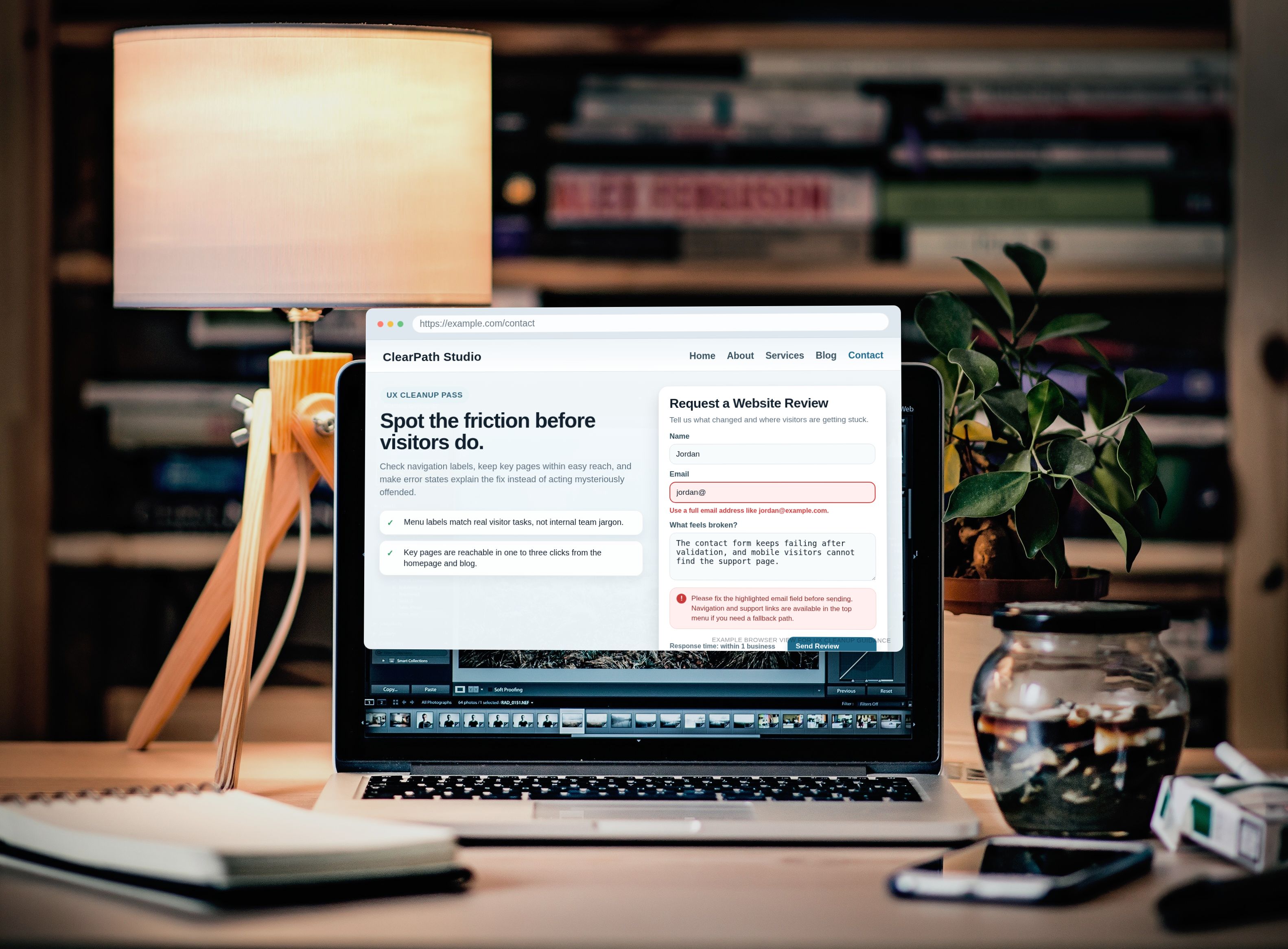
There is a reason this matters. Clear navigation and responsive structure are not aesthetic hobbies; they are basic usability work. Google’s guide to building the main navigation for a website explains how users find their way through a site, while MDN’s <nav> reference and <section> reference both reinforce a simple rule: structure has a job, and empty structure is still empty. For mobile layouts, web.dev’s accessible responsive design guide makes the same point from a different angle: if the first screen is cluttered or vague, the page starts losing before it has begun.
Here is the practical version: decide the home page’s job, put the most useful sections in a sane order, write a hero that answers the obvious questions, and place calls to action where people can actually use them. Then measure whether the page helps visitors move forward instead of wandering around the site like a confused tourist at a badly signed train station.
A few terms first
Before the page gets rebuilt, it helps to define the small bits of jargon that keep people pretending they understand layout decisions when they do not.
| Term | What it means | Why it matters |
|---|---|---|
| Hero | The first visible section at the top of the page, usually with a headline, supporting copy, and one primary action. | It sets the frame. If the hero is vague, everything after it has to do too much work. |
| CTA | Call to action. The button or link that tells visitors what to do next. | Without a CTA, the page is a suggestion. Suggestions do not convert. |
| Trust signal | Proof that the site is real, credible, and worth attention. | Testimonials, years in business, certifications, policies, and recognizable partners all reduce hesitation. |
| Jump link | An internal link that takes a visitor straight to a useful section or category. | It shortens the path for people who already know what they want. |
| Scroll depth | How far visitors move down the page before they stop. | It tells you whether the layout is pulling people forward or just occupying screen space. |
1. Decide the home page job
The first diagnostic step is not design. It is purpose. A home page that tries to do everything usually ends up doing nothing well. Decide on one primary goal and two supporting goals. That is enough. The rest belongs on other pages, where it can stop competing with the main action.
For most small and mid-sized sites, the primary goal is one of these: contact the business, browse the main offer, book a service, or subscribe. The supporting goals should help visitors reach that action with less friction. For example, a service business may want visitors to read the service overview and then contact the team. A content site may want readers to browse categories and then join a newsletter. A local business may want people to see hours, trust signals, and the contact path without hunting around the layout like it owes them money.
| Page type | Primary goal | Supporting goal 1 | Supporting goal 2 |
|---|---|---|---|
| Service business | Request contact | Review services | Check trust signals |
| Content site | Read featured content | Browse categories | Subscribe to updates |
| Portfolio or studio | Book a call | See recent work | Read about the approach |
| Local business | Call or contact | Find service details | Confirm location and hours |
If the home page has three or more competing primary goals, the reader experiences decision fatigue. That is not a mystery. It is a queue. People do not wait in line for unclear websites.
Use this rule: one action above the fold, one clear backup action, and one softer path for people who are not ready yet. If your site is still asking for a fourth and fifth objective, those belong on Services, Blog, or About, not on the home page’s first screen.
2. Recommended section order
There is a sequence that works because it matches how people scan. Start with the answer, then show the proof, then show the paths. Anything else is a hobby.
- Hero section – explain who the site is for, what it offers, and what to do next.
- Trust signals – reduce doubt before the visitor starts comparing options.
- Key categories or services – show the main routes through the site.
- Featured content or featured offer – highlight the most useful or most strategic item.
- Social proof – testimonials, reviews, or short proof points.
- FAQ – answer objections before they get noisy.
- Final CTA – repeat the main action without making it feel like a hostage note.
This order gives the visitor a clean progression. It also keeps the top of the page from becoming a pile of disconnected blocks. The home page is not a scrapbook. It is a route.
| Section | Job | What good looks like | Common failure |
|---|---|---|---|
| Hero | Orient the visitor | Headline, proof, CTA in one screen | Generic welcome copy |
| Trust | Remove hesitation | Credible proof near the CTA | Badges with no explanation |
| Categories | Offer paths | 3-6 clear choices | Too many equal-weight options |
| Featured content | Lead toward the next step | One item that solves a real problem | Random content blocks |
| Social proof | Confirm credibility | Specific, short, believable quotes | Stock testimonials with no detail |
| FAQ | Answer objections | Concrete questions visitors actually ask | Fluff designed for SEO theater |
| Final CTA | Close the loop | One clear action with low friction | Another vague “learn more” button |
If a section has no clear job, it is probably there because somebody liked the idea of “having a section.” That is not a reason. It is a habit.
3. Craft the hero section
The hero should answer four questions fast: who is this for, what problem does it solve, why should I believe it, and what should I do next. That is the whole game. If the answer is buried under decorative wording, the visitor gets to do the thinking for you. That rarely ends well.
A useful hero formula looks like this:
- Headline: Say what the site does in plain language.
- Subheadline: Say why it matters to the reader.
- Proof line: Add one credibility marker, such as a testimonial, years in business, or a metric.
- Primary CTA: Tell the visitor the next action.
- Secondary CTA: Offer a lower-friction path, such as browsing services or reading the blog.
Example for a service business: “Clear, direct website support for businesses that need a home page people can actually use.” The subheadline can explain the fix: “Turn confusion into a clean path to contact, browse, or book.” Then a line of proof: “Trusted by teams that want fewer dead ends and less guesswork.” Then the CTA: Contact us. A secondary link can point to Services.
Example for a content site: “Practical guides for making a site easier to understand and easier to use.” The proof line may be a simple statement such as “New articles added regularly.” The primary CTA can be Browse the blog, with a secondary path to About for readers who want the backstory. Nothing exotic. Just enough clarity to prevent instant confusion.
Do not pack the hero with three paragraphs of background, four buttons, and a decorative image that has no obvious connection to the actual offer. A good hero is not a speech. It is a checkpoint.
Also, do not write headlines that sound like they were generated by a committee trying to avoid the danger of saying anything. “Welcome to our website” does not help anybody. It is wallpaper in sentence form.
4. Present navigation effectively
Navigation is not a dumping ground for every page you own. It is a pathfinder. Google’s navigation guidance and MDN’s semantic HTML docs both point in the same direction: keep navigation meaningful, labeled clearly, and usable on real devices. That sounds boring because it is boring. Boring is what keeps people from getting lost.
Use category tiles, jump links, or a short list of top-level routes. If the site has many pages, organize them by visitor intent rather than by internal department history. Visitors do not care about the organizational chart. They care about getting to the thing they want without a scavenger hunt.
- Show 3-6 main choices, not 14.
- Use labels people would actually search for.
- Keep the same names in the hero, the menu, and the footer.
- Make the mobile version as direct as the desktop version.
For this site, the useful interior paths are obvious: Services for what the business does, About for background and trust, Blog for deeper reading, and Contact for action. That is enough structure for a reader who wants clarity instead of architecture homework.
If you use jump links, point them at the page’s real sections rather than inventing a secret language. A jump link should say “Services,” not “Solutions” unless the page actually uses that word in a meaningful way. People should not need a decoder ring to read your navigation.
One practical test: if a first-time visitor can explain the site’s top-level menu after glancing at it for five seconds, you are close. If they need a nap and a whiteboard, you are not close.
5. Incorporate trust signals
Trust signals should be visible early and repeated where a decision happens. Do not hide all proof in the footer and then act surprised when nobody reads it. The page should show enough evidence to lower hesitation before the visitor reaches for the button.
Useful trust signals include:
- Short testimonials with names or roles, when available.
- Years in business or years of experience, if they are real and relevant.
- Certifications, memberships, or standards that can be verified.
- Clear guarantees or response-time promises, if the site can actually honor them.
- Visible contact details and support paths.
- Policy pages and a clean About page that does not read like it was assembled from a motivational poster.
The placement matters as much as the signal. Put a trust strip below the hero. Put a stronger proof block near the main CTA. Repeat proof near the bottom for readers who need more time. If the site relies on social proof, let the proof be short and specific. “They fixed the layout and the contact flow in one pass” is better than “Amazing work!!!” because the first one says something and the second one says somebody liked typing exclamation marks.
For content-heavy sites, trust can also come from editorial clarity. A useful introduction, clear dates, and a consistent category structure are all signals. That is especially helpful when the home page routes visitors into the blog instead of directly into a sales action.
6. Develop a CTA strategy
A CTA is not a decorative button. It is the page’s handshake. It should say exactly what happens next. “Contact,” “Book a call,” “Browse services,” “Read the blog,” and “Subscribe” are all better than “Learn more,” because “learn more” is what people click when they have no idea why they are clicking.
Use one main CTA above the fold and one or two secondary CTAs lower on the page. The main CTA should match the page’s primary goal. Secondary CTAs should support it without hijacking attention.
| Site type | Main CTA | Secondary CTA | Why it works |
|---|---|---|---|
| Service site | Contact us | View services | Moves the reader from interest to action |
| Portfolio | Book a call | See recent work | Gives proof before commitment |
| Content site | Browse the blog | Subscribe | Lets the reader choose depth or ongoing updates |
| Local business | Call now or contact | Check hours / location | Removes friction for quick decision-making |
Here is the useful rule: the closer the visitor is to conversion, the more specific the CTA should become. Near the hero, a visitor may only be ready to browse. Lower on the page, they may be ready to contact. Both are valid, but they should not fight each other. If every section shouts a different instruction, the page becomes an argument with itself.
On the home page, the main CTA should do one clear job. If you need the softer path, offer a secondary link to Blog or About. That keeps the page useful for people who are not ready to make a decision yet, which is most of them, because humans are annoyingly human.
7. Common home page mistakes
The usual failures are boring, which is why they keep happening.
- Vague headlines. If the hero says nothing specific, the visitor has to guess.
- Blank sections. Empty space with no job is just wasted screen area.
- Too many buttons. Five CTAs in one block is not choice. It is static.
- Duplicate messages. If the hero, the category tiles, and the featured content all say the same thing, the page has no depth.
- Trust pushed to the footer. That is where people send things they do not trust.
- Mobile clutter. If the page works on desktop but turns into a stack of shouting blocks on a phone, the design failed where it matters most.
- Unrelated imagery. Stock art that says “vibes” instead of “service” is not helping.
One more failure is subtle: the home page can be visually polished and still be unhelpful. A nice layout does not rescue vague copy. A pretty button does not explain the offer. A polished site with no clear next step is still a dead end, just a more expensive-looking one.
8. Quick audit checklist
If the home page needs a sanity check, run this 30-minute audit before you decide to redesign anything. The point is to find the actual problem, not to feed the design machine because it looks hungry.
| Check | Question | Pass looks like |
|---|---|---|
| Headline clarity | Can a new visitor say what the site does in one sentence? | The answer is yes without interpretation. |
| Hero CTA | Is there one obvious action above the fold? | The button is easy to spot and matches the page goal. |
| Section order | Do the sections follow a useful sequence? | Hero, trust, options, proof, FAQ, final CTA. |
| Navigation | Are the main choices simple and predictable? | 3-6 clean links, not a link parade. |
| Mobile layout | Does the page still make sense on a phone? | Readable type, tap-friendly buttons, no crushed spacing. |
| Trust signals | Are proof points visible before the user has to hunt? | Testimonials or proof appear near the main action. |
| Internal links | Can visitors reach Services, About, Blog, and Contact easily? | Yes, from the home page and from the footer. |
| Copy density | Is the copy scannable? | Short paragraphs, clear headings, no wall of text. |
Do the audit on mobile first if you can. The smaller screen exposes clutter faster. Desktop layouts can hide sins in spare space. Mobile refuses to be polite about it.
When a section fails the audit, fix the section, not the whole page by instinct. People love to redesign entire websites when the real issue is one line of copy and a bad button label. That is how projects become rituals.
9. Measure and iterate
Do not trust opinions when you can inspect behavior. Measure whether the home page helps people do what the page was built to do.
| Metric | What it tells you | What to watch for |
|---|---|---|
| CTA click-through rate | Whether the main action is clear enough to earn clicks | Low clicks usually mean weak copy, poor placement, or both |
| Scroll depth | Whether visitors continue past the hero | Drop-off near the top usually means the first screen is unclear |
| Conversion rate | Whether the home page supports the real business goal | Traffic without conversion is decorative |
| Internal navigation clicks | Whether visitors use the categories or jump links | Low usage may mean the labels do not match intent |
| Engagement with featured content | Whether the featured block is actually useful | If nobody clicks it, it is not featured; it is hidden in plain sight |
Make one change at a time where possible. Change the hero headline, then watch the numbers. Change the primary CTA, then watch again. Change the section order, then check whether scroll depth and click behavior improve. If you change everything at once, you will learn nothing except that your patience is weaker than your ambition.
For timing, give a change enough room to collect behavior from a meaningful sample. A single afternoon is not a theory. It is a mood. If the site has enough traffic, compare before and after on the same device type or traffic segment so mobile problems do not hide behind desktop results.
Conclusion
A home page makeover is not about making the page prettier. It is about making the site easier to understand and easier to use. Decide the page’s job, keep the section order logical, write a hero that answers the obvious questions, and give visitors a clean next step. Then back it up with trust signals, a sober navigation structure, and CTAs that are specific enough to mean something.
If the home page does its job, the rest of the site gets easier to run. The Services page can carry the details, the About page can carry the credibility, the Blog can carry the depth, and the Contact page can carry the action. The home page just has to stop pretending it is all of those pages at once.
Start with the first diagnostic step: define the home page’s primary job in one sentence. If that sentence is vague, the design will be vague, the copy will wander, and the CTA will do that weird polite thing where it exists without persuading anyone. Fix the sentence first. The rest is mechanical.