If your site update “looked fine” and nobody tested the money paths, that is not quality assurance. That is optimism wearing a lanyard.
Readers usually come looking for this checklist because they are trying to answer a few very practical questions before a broken flow answers them first:
- How do I test forms, on-site search, and checkout without turning QA into a week-long ritual?
- Which failures matter most after a site update: validation bugs, zero-results dead ends, wrong totals, missing emails, or all of the above?
- What should I verify on mobile, with a keyboard, and under slow conditions before visitors do it for me?
- How do I decide whether the site is actually ready or just temporarily quiet?
Steve Krug’s blunt reminder still applies: “Don’t make me think.” Don Norman made the same point from another angle: design is communication, and broken flows communicate incompetence very quickly. That is why I like grounding this kind of review in boring evidence rather than ceremony. WebAIM’s WCAG checklist is a useful reality check for labels, focus order, and readable errors, while Baymard’s checkout research is a standing reminder that small friction in high-intent flows costs real conversions.
The actual problem is simple: forms, search, and checkout sit on top of plugins, templates, scripts, validation rules, third-party services, and browser behavior. Update one layer and another layer decides to become art. A form submits but no email arrives. Search returns zero useful results because a filter was quietly reset. Checkout shows the wrong shipping method until the last step, which is a charming way to lose trust in under two minutes.
In this guide, I will give you a step-by-step QA checklist for those three critical flows, plus the setup, accessibility checks, performance sanity checks, issue logging rules, and a go/no-go rubric. If you want broader planning context around site updates, start with the home page, browse the blog, and keep the supporting pages for about, services, and contact within reach while you test.
Quick definitions before you start poking the wiring
Terms first. Teams waste time arguing because one person says “the form works” and means the button clicked, while another person means the user got a confirmation message, the admin got an email, the CRM entry exists, and the error states are readable. Those are not the same thing.
| Term | Plain-English meaning | Why it matters |
|---|---|---|
| Happy path | The ideal flow where the user enters valid data and nothing goes wrong | The happy path proves very little on its own. |
| Negative test | A deliberate bad input or failure condition used to trigger validation and error handling | This is where weak rules and vague messages show up. |
| Zero-results state | The screen a user sees when search finds nothing useful | If it is blank or smug, visitors leave. |
| Abandoned checkout | A cart flow that starts but is not completed | Bad totals, surprise fees, and broken payment steps often cause it. |
| Reproduction steps | The exact sequence required to make the bug happen again | If nobody can reproduce it, nobody fixes the actual problem. |
Why forms, search, and checkout break after updates
Because they are where multiple systems collide. Everyone likes blaming “the update” as if software were possessed by a weather event. Usually the mechanism is less mystical and more embarrassing.
- Code conflicts: a script loads in a different order, a selector changes, a validation library is replaced, or a template override is stale.
- Plugin or extension mismatch: one component expects old field names, old hooks, old endpoints, or old CSS classes.
- Browser differences: a flow works in one modern desktop browser and folds in half on mobile Safari, which has a long and theatrical history of finding assumptions you forgot you made.
- Caching and stale assets: the frontend uses new markup, the browser loads old scripts, and now the page looks normal while the behavior lies.
- Configuration drift: tax rules, shipping zones, email routing, search indexing rules, or CAPTCHA settings changed quietly in the background.
The common pattern is this: the page renders, so teams assume the flow works. Rendering is not completion. A form with a broken notification, a search box with useless results, and a checkout with bad totals are all technically “visible.” Visibility is a low bar. Houseplants clear it.
Pre-test setup: accounts, devices, data, and logging
Check the boring thing first. QA gets sloppy when people improvise test data, switch devices halfway through, or forget which version of the browser they used. Set up the test like you expect to find something.
Create test identities and test data
- One guest user with no saved state
- One returning user with an existing account
- One admin or support-side account to verify notifications and orders
- One clean set of fake but realistic names, addresses, phone numbers, and email inboxes for testing
- One list of known search queries: exact match, partial match, typo, no-result phrase, and product/service keyword
- One small set of checkout scenarios: standard order, promo-code order, shipping change, tax-sensitive order, and failed payment retry
Use consistent data across runs. If one tester enters “555-1234” and another pastes junk from a spreadsheet with hidden spaces, you are now debugging two different problems and pretending they are one.
Define the browser and device matrix
| Platform | Minimum coverage | What to watch for |
|---|---|---|
| Desktop | Chrome, Safari, Firefox, or Edge depending on audience | Validation behavior, autofill quirks, modal overlays, payment step rendering |
| Mobile | iPhone Safari and one Android browser | Keyboard overlap, tap target size, sticky buttons, address forms, wallet options |
| Assistive or keyboard-only pass | At least one complete run without a mouse | Focus order, visible focus state, operable controls, readable errors |
Set logging expectations before testing
I use a simple rule: if a tester cannot say what they did, what they expected, what happened instead, and whether it happened twice, the ticket is not ready. Capture this for every issue:
- Environment: device, browser, account state, and URL
- Exact test data used
- Step-by-step reproduction path
- Expected result
- Actual result
- Screenshot or screen recording
- Severity and likely owner
If your team is sketching replacement workflows before you change production logic, a neutral prototype tool such as this useful resource on planning simple internal tools can help map form steps or internal admin flows quickly. Fine. Useful resource. Still test the real site, because mockups do not pay for failed checkouts.
Forms QA checklist: validation, uploads, spam protection, and notifications
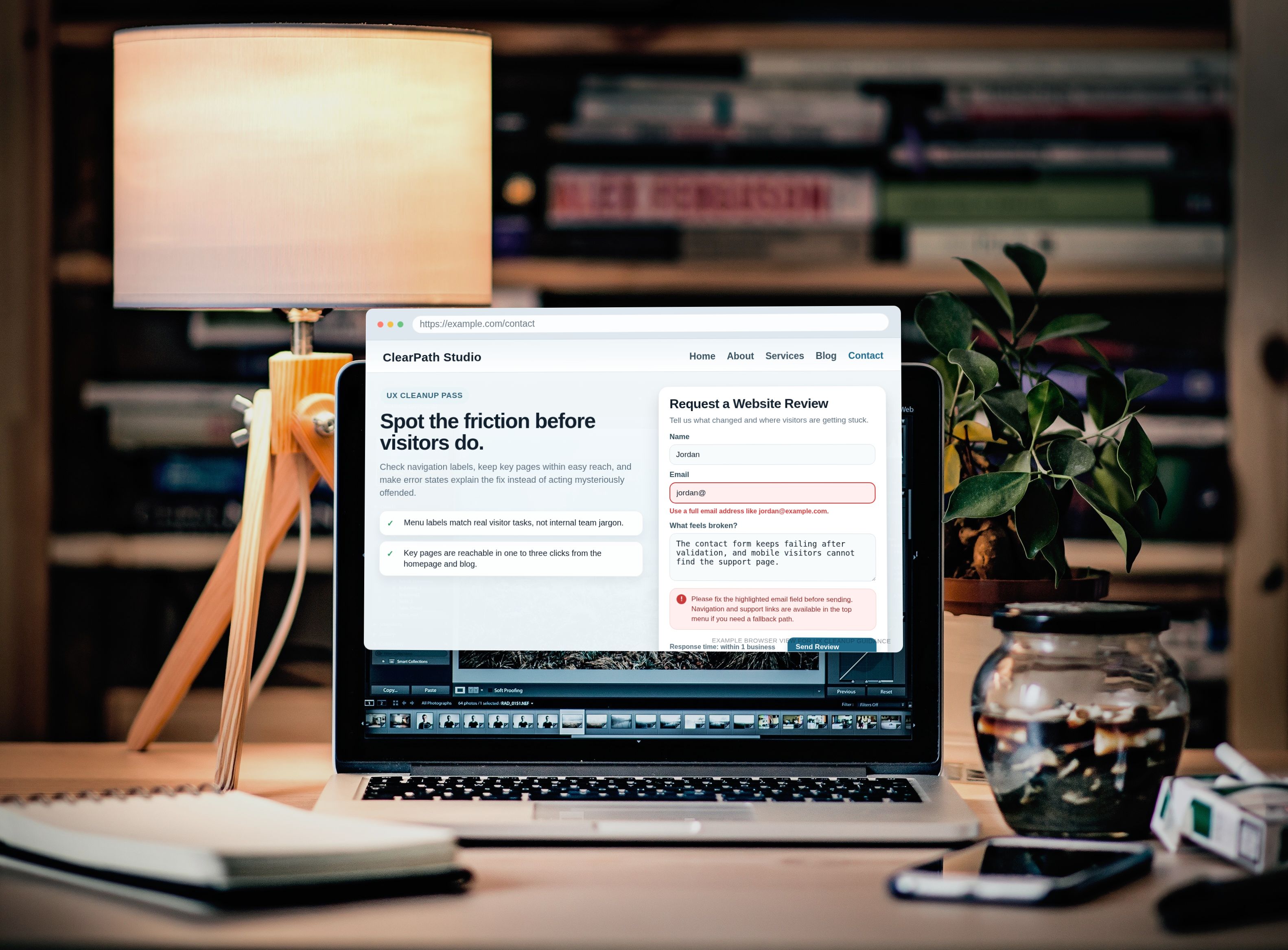
Forms break in two ways: loudly or politely. Loud failures are easy. The button does nothing, the page errors, the upload fails. Polite failures are nastier: the success message appears, but the email never arrives; the required field rules differ between desktop and mobile; the form lets junk through and blocks real users. Very modern. Very efficient. Very bad.
1. Field and validation rules
- Submit the form with every required field blank. Confirm each missing field is identified clearly.
- Enter invalid email formats, short phone numbers, and over-limit text. Confirm the rule matches the field’s actual business need.
- Check whether validation runs inline, on blur, on submit, or all three. Mixed behavior often feels broken even when it is technically functioning.
- Verify optional fields are truly optional and do not block submission silently.
- Test copy-paste input with leading or trailing spaces. Trim behavior should help the user, not punish them.
Pass condition: the form blocks bad input consistently and explains the fix in plain language. “Invalid field” is not a message. It is a bureaucratic shrug.
2. Error and success messaging
| Check | Pass | Fail |
|---|---|---|
| Required field message | Tells the user what is missing and how to fix it | Generic error with no field context |
| Submission success | Confirms the action and explains what happens next | Blank refresh, redirect loop, or vague “sent” message |
| Server-side failure | Shows a fallback action like retry or direct contact path | Silent failure or endless spinner |
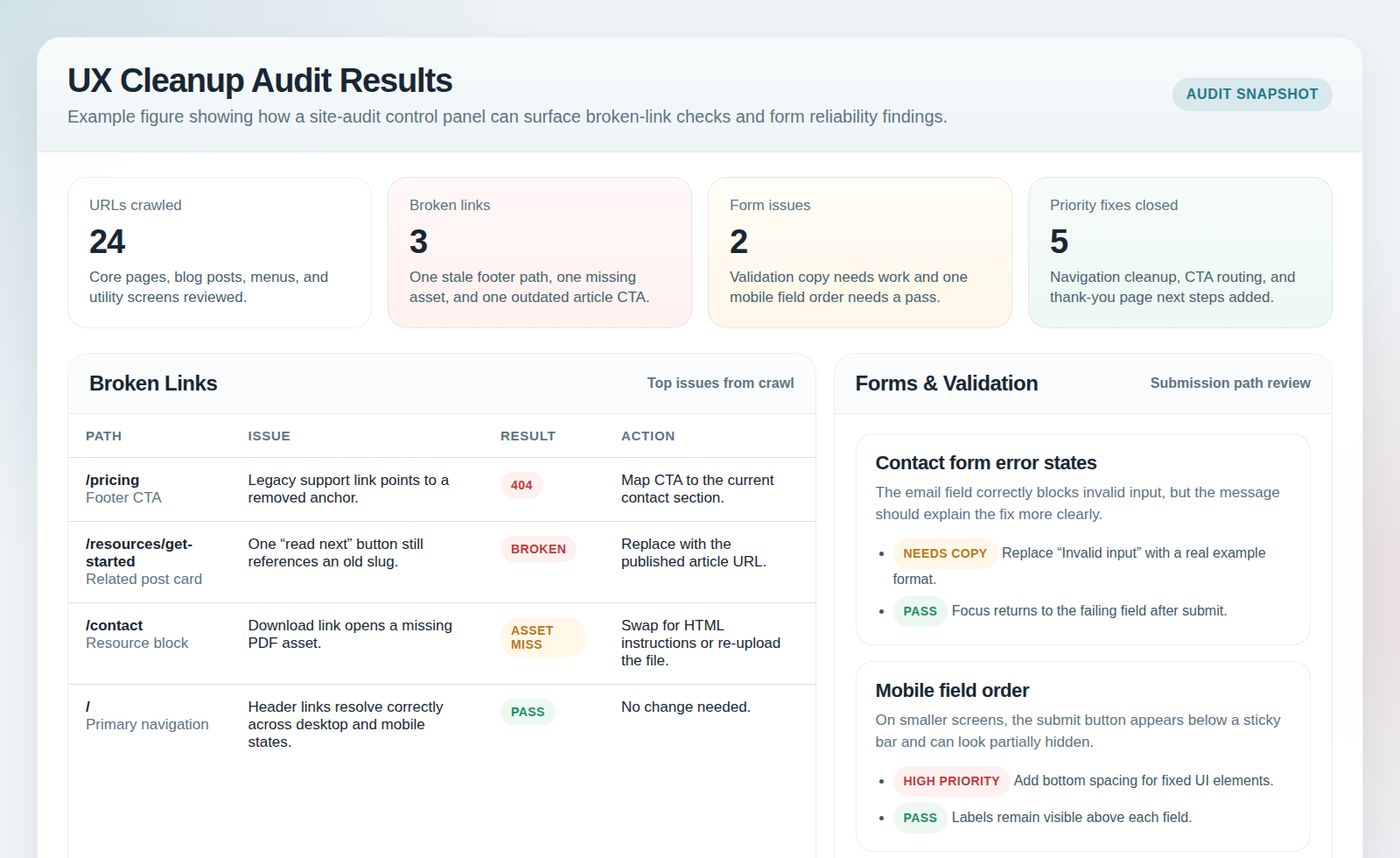
Test the success state carefully. A success banner is cheap. Proof is better. Confirm the admin inbox, support queue, or stored submission actually receives the data. If the form says “thank you” and nobody receives anything, the form is lying with a smile.
3. Spam protection and file uploads
- Trigger the anti-spam mechanism once on desktop and once on mobile. Make sure real users can recover if challenged.
- Try a valid file type under the size limit and an invalid file type over the limit.
- Check filename handling for spaces and long names.
- Confirm uploaded files attach to the right record, email, or support ticket when applicable.
- Test double-click submit behavior to rule out duplicate entries.
Common real-world failure: the upload control accepts a file, the frontend shows success, and the backend drops it because the file limit changed in one layer but not the other. Another classic: CAPTCHA works until a mobile browser blocks a third-party script. Again, not magic. Just three systems disagreeing in public.
Search QA checklist: indexing expectations, filters, typo handling, and mobile layout
Search is where sites reveal whether they understand their own content. A search box that returns nothing useful is basically customer service outsourcing to frustration.
1. Confirm indexing expectations
- Search for a known page or product by exact title.
- Search by a partial phrase, synonym, and common shorthand.
- Verify priority content appears near the top when it should.
- Check whether newly published or updated content appears when expected.
Not everything should be searchable, but the rules should be intentional. If service pages vanish from search after a template update, that is not “just search being weird.” That is a broken discovery path.
2. Test zero-results behavior and typo tolerance
- Run one nonsense query and confirm the zero-results page offers a next step: broader suggestions, category links, or contact help.
- Run one obvious typo. “Checkuot,” “retun policy,” or “contcat” should not send the user into the void if your content set is small and predictable.
- Check whether search strips punctuation, handles plurals, and tolerates case differences.
Pass condition: the search flow helps the visitor recover, even when the query is bad. A blank page with “0 results” is not honesty. It is surrender.
3. Filters, sorting, and mobile layout
| Area | What to test | Common failure |
|---|---|---|
| Filters | Apply one filter, two filters, then clear all | URL state and visible results fall out of sync |
| Sorting | Switch sort order and reload or paginate | Results reset or sort label lies about actual order |
| Mobile layout | Open search, type, filter, and return to results on a phone | Keyboard covers controls or filter drawer traps the user |
One useful exercise: start from a real visitor question and see whether internal search can answer it in two searches or fewer. If not, improve the content model, the labels, or the result snippets. Do not just glare at analytics and hope the box learns remorse.
Checkout QA checklist: totals, taxes, shipping, payments, confirmation, and receipts
Checkout is where polite bugs become expensive bugs. This section deserves the strictest pass/fail rules because intent is highest and patience is lowest.
1. Cart and pricing accuracy
- Add one item, then multiple quantities. Confirm subtotal math holds.
- Change quantity, remove an item, and return from cart to product page and back.
- Apply a promo code and verify the discount appears in the right place and persists through the next step.
- Test without the promo code as a control case.
Pass condition: every visible total matches the next visible total unless the user changed an input that justifies the difference. Surprise math is not delightful. It is suspicious.
2. Address, shipping, and tax display
- Enter a valid address slowly, then with browser autofill, then on mobile.
- Change region, postal code, or shipping method and confirm totals update immediately and correctly.
- Verify tax labels are understandable and not duplicated or hidden until the last second.
- Test edge cases your business actually serves, such as local pickup, digital-only orders, or mixed carts.
Common failure: shipping estimates show one thing in the cart and another at payment because the shipping service or zone table updated partially. Another classic: browser autofill inserts a state code or apartment field in a format the validator suddenly dislikes. Users call this “the site being broken.” They are correct.
3. Payment method selection and failure recovery
- Test each visible payment method at least once.
- Force one failure case: declined card, interrupted wallet flow, or timeout.
- Confirm the user can recover without losing the cart.
- Verify duplicate orders are not created if the user retries after a delay.
Payment failure handling matters as much as success. If a retry creates two orders, or the user has to rebuild the cart after a declined card, you have not built resilience. You have built a complaint machine.
4. Confirmation page and receipt email
- Check the confirmation page for order number, item summary, shipping method, billing amount, and next-step guidance.
- Verify the receipt email arrives in the expected inbox and contains the same critical details.
- Confirm links in the confirmation page and email work on mobile.
- Make sure the page is not indexable if it contains personal order details.
The confirmation screen should reassure, not raise new questions. If it says “thank you” and omits the total, the order ID, or what happens next, the site managed to fumble after the user already trusted it with money. Impressive in the worst possible way.
Accessibility and usability checks for all three flows
Accessibility is not a decorative bonus pass. It is part of whether the flow works at all.
- Every field needs a real visible label, not placeholder-only cosplay.
- Focus order must follow visual order and not jump into hidden controls.
- All interactive controls should be operable by keyboard alone.
- Error messages must be readable, specific, and visually connected to the offending field.
- Color cannot be the only signal for errors, success, or selected options.
- Tap targets on mobile should be comfortably usable without surgical fingers.
A fast way to spot trouble is to complete one full form, one search, and one checkout without touching the mouse. Then zoom the page to 200% and repeat the ugly parts. If the interface collapses, overlaps, or hides its own messages, you found an actual problem, not a theoretical compliance debate.
Performance sanity checks during critical flows
No, you do not need to turn every QA run into a lab report. Yes, you still need to check the basics.
- Measure whether the page becomes usable quickly, especially on mobile data or throttled conditions.
- Watch for layout shift when validation messages, promo-code fields, or shipping options appear.
- Test timeout behavior on search and payment requests.
- Refresh after a transient failure and confirm the user does not lose all progress unnecessarily.
- Check whether loaders and disabled buttons communicate progress honestly rather than spinning forever like a philosophical statement.
The goal here is not a perfect scorecard. The goal is to rule out sluggish behavior that causes abandonment in moments where the user is already doing work. A checkout button that freezes for eight seconds without feedback is not “probably fine.” It is a dare.
How to document issues so they actually get fixed
I prefer a short severity model because long severity models become fiction quickly.
| Severity | Definition | Example | Likely owner |
|---|---|---|---|
| Critical | Blocks submission, search, or checkout completion | Payment step fails for valid orders | Engineering or platform owner immediately |
| Major | Flow works but misleads, loses data, or creates high confusion | Form success shows, but no notification is sent | Engineering plus operations or support |
| Minor | Does not block completion but degrades clarity or trust | Promo error text is vague or misaligned | Content, UX, or frontend owner |
For every issue, include:
- One-line symptom summary
- Exact reproduction steps
- Expected result and actual result
- Environment details
- Screenshot or recording
- Severity
- Who owns the next action
If the issue crosses teams, split the owner by mechanism, not by politics. Example: checkout tax display mismatch may involve configuration, frontend presentation, and payment provider handling. “Someone should check it” is not ownership. It is a prayer.
Go/no-go rubric: is the site ready for visitors?
Use this quick rubric before you announce anything.
| Question | Go | No-go |
|---|---|---|
| Can users complete the primary form from desktop and mobile? | Yes, with clear errors and confirmed delivery | No, or delivery is unverified |
| Can search help users recover from exact, partial, and bad queries? | Yes, with useful results or useful recovery | No, zero-results and filter behavior are broken |
| Can checkout complete accurately with correct totals and receipt? | Yes, across core scenarios | No, any money-path bug remains unresolved |
| Can keyboard and mobile users complete the same flows? | Yes, without hidden blockers | No, focus, labels, or tap targets fail |
| Are remaining issues minor and documented with owners? | Yes | No, critical or major issues remain open |
No-go rule: if forms, search, or checkout have an unresolved critical issue, do not call the site ready. Not because perfection is required. Because pretending the money path is fine when it is not is how teams create support debt, refund work, and public embarrassment for free.
Conclusion: run the flow, not the story you told yourself
The clean version is simple. Test forms end to end. Test search like a real user, not like the person who named the pages. Test checkout with realistic addresses, promo codes, payment failures, and confirmation emails. Then run one keyboard-only pass and one mobile pass, log issues with discipline, and make the go/no-go decision based on evidence instead of relief.
If you only do one thing before changing anything else, do this: open a fresh browser session and complete one full form submission, one search with a typo and a zero-result recovery, and one full checkout from cart to receipt. That single pass rules out a surprising amount of expensive fiction.