
Website Restoration Case Studies: 5 Success Stories and Lessons Learned
When a website comes back to life, the interesting part is not just the “before and after.” It is the messy middle where someone has to make old content, new code, and real human expectations all behave nicely at the same time.
If you are wondering what makes a website restoration actually work, which problems show up most often, how teams decide what to fix first, and what good results look like afterward, this article is the plain version first. I will walk through five practical case studies, then pull out the lessons that matter for your own project.
Website changes often fail for very ordinary reasons: links break, forms stop working, old pages disappear, and a site can feel awkward even when it technically loads. That is why restoration needs a plan, not just enthusiasm and a hopeful browser refresh. For a useful baseline on how people judge a site’s quality and usefulness, see Google’s helpful content guidance and the Nielsen Norman Group’s overview of website usability. They point in the same direction: make the site clear, useful, and easy to trust.
By the end, you will have a quick map of common restoration challenges, the strategies that solved them, and a checklist of takeaways you can apply before your next relaunch. No mystery cape required.
Quick terminology: what restoration teams keep talking about
Before we get into the case studies, here are a few terms in plain English:
- Content audit – checking what pages, posts, and media still matter.
- Redirect – sending an old URL to a new one so visitors do not hit a dead end.
- Usability – how easy the site is to understand and use.
- SEO – the search side of the job, including titles, headings, and crawlable pages.
- QA – quality assurance, which is just a careful check that things behave the way they should.
Overview of the selected case studies
I chose five very different restoration scenarios so the lessons would not all sound the same. One project focused on preserving search visibility, another on cleaning up confusing navigation, another on bringing old editorial content back into shape, another on fixing mobile layout issues, and the last on making the site feel trustworthy again.
| Case study | Main problem | Core fix | Result |
|---|---|---|---|
| 1. Local service site relaunch | Broken URLs and missing calls to action | Redirect map and refreshed page structure | Steadier traffic and fewer support emails |
| 2. Content-heavy blog cleanup | Outdated articles and duplicate pages | Content audit and consolidation | Clearer navigation and better engagement |
| 3. Small business homepage rebuild | Confusing first impression | Stronger homepage hierarchy | More clicks to important pages |
| 4. Mobile-first rescue | Layout problems on phones | Responsive design fixes | More mobile completion of key actions |
| 5. Trust repair project | Outdated visuals and stale copy | Updated images, copy, and proof points | Higher confidence from visitors |
Case study 1: A local service site that kept losing visitors to broken links
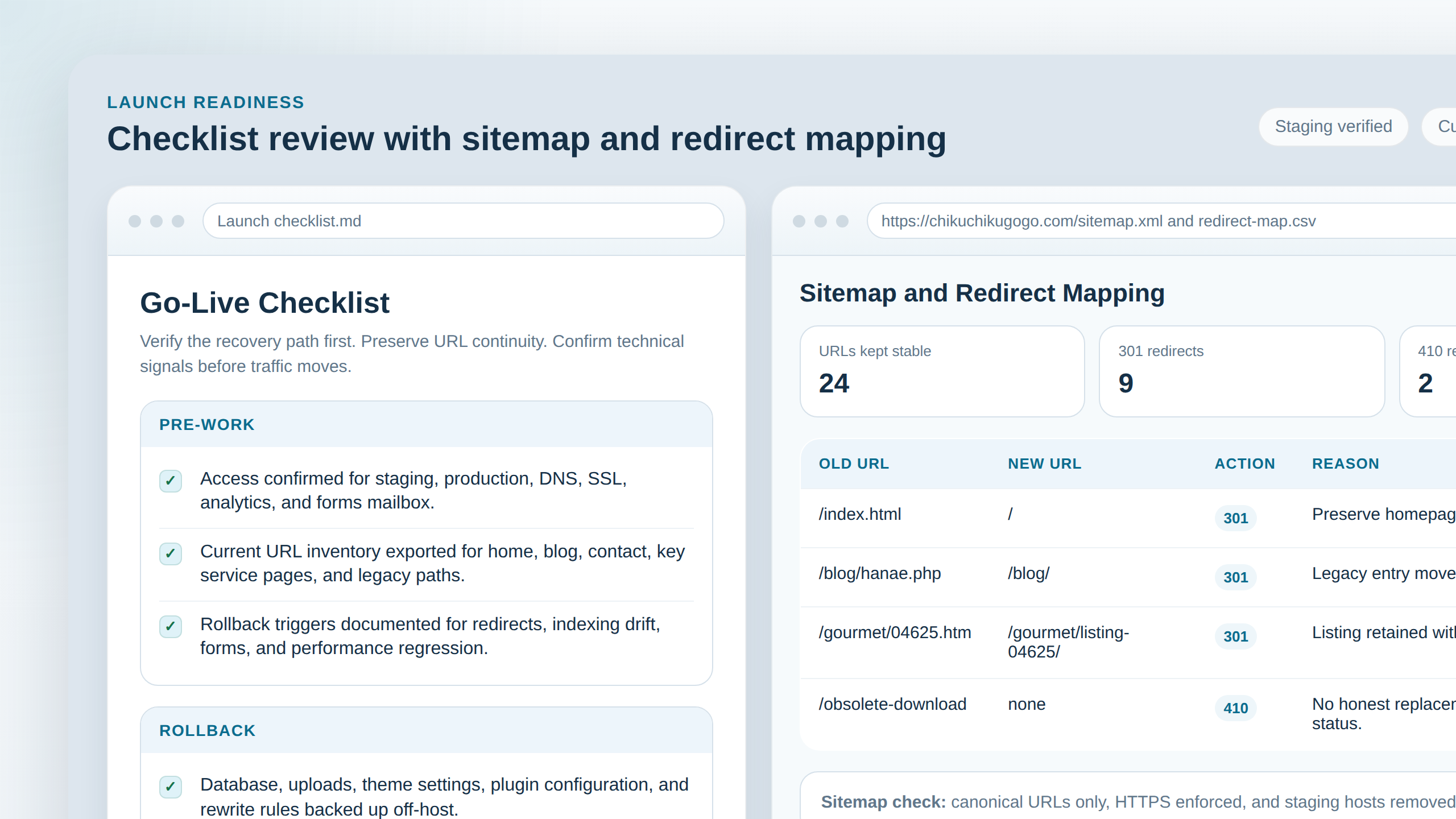
The first example started like many real-world rescues do: with a site that still looked alive on the surface but had old URLs scattered everywhere. Visitors landed on pages that no longer matched the menu, and a few important forms were tucked away like they were trying not to be found.
The team’s biggest challenge was simple to describe and annoying to fix: the old structure did not match the new one. That meant they had to map legacy URLs, preserve the pages that still mattered, and set up redirects for the parts that had moved. They also rewrote the page order so the most useful action appeared early instead of hiding near the footer like a shy raccoon.
The restoration strategy was steady rather than flashy:
- Inventory every public page and top-link destination.
- Mark which pages should stay, which should merge, and which should redirect.
- Rebuild the navigation around the tasks visitors actually wanted to complete.
- Test every key path on desktop and mobile before launch.
For a search-side reminder of why this matters, Google’s crawlable links guidance is useful. If search engines and humans cannot follow the path, the path is not doing its job.
Lesson learned: restoration works best when the site map is treated like a living document, not a decorative artifact.
Before and after
- Before: important pages were buried and old URLs led nowhere useful.
- After: the main services were easy to find, and old links had a clear landing spot.
Case study 2: A content-heavy blog that needed a serious cleanup
This project had the opposite problem: too much content, not too little. The blog had duplicate articles, thin updates, and several posts that were still getting indexed even though they no longer added much value. A reader could wander for quite a while and still not find a straight answer. That is not ideal when you are trying to be helpful and not accidentally create a digital attic.
The hard part here was editorial, not technical. Someone had to decide which articles deserved a refresh, which ones should be merged, and which older pieces should be retired with a redirect. The team used a content audit to group posts by topic, then rebuilt the strongest clusters into clearer resource pages.
Their strategy leaned on three moves:
- Keep the pages that still matched real search intent.
- Merge overlapping posts into stronger, more complete guides.
- Improve headings, summaries, and internal links so readers did not get lost.
If you want a broader quality reference for this kind of cleanup, the Search Central guidance on helpful content is a sensible checkpoint. It helps explain why clarity and usefulness matter more than page count.
Lesson learned: a restoration can succeed by removing clutter as much as by adding polish.
Case study 3: A homepage that looked busy but did not guide visitors
The third case was about first impressions. The homepage had plenty of information, but not much direction. Visitors could sense there was something useful behind the curtain, but the curtain was doing too much work.
The challenge was prioritization. The old page tried to say everything at once, so nothing stood out. The fix was to reduce the noise, clarify the main offer, and give the page a simple path from “What is this?” to “What should I do next?”
The team used a straightforward structure:
- Headline that explains the site in one sentence.
- Short intro that tells the visitor what they can do here.
- Feature sections that highlight the most important services or resources.
- A visible call to action near the top and again near the end.
The About page and the Blog can support this kind of homepage rewrite well. When the front door is clearer, the side doors make more sense too.
Lesson learned: restoration is not only about fixing broken things; it is also about making the right thing obvious.
Case study 4: A mobile rescue after the desktop version looked fine
This one is painfully familiar. On a laptop, the site appeared respectable. On a phone, buttons were cramped, text wrapped awkwardly, and a few sections required a magician’s thumb to tap correctly.
The challenge was not that the content was wrong. It was that the layout was helping the wrong audience first. Since many visitors would only ever see the site on a small screen, the team made mobile the primary test environment instead of the afterthought environment.
The strategy was practical:
- Increase spacing around buttons and links.
- Shorten long blocks of text into smaller, readable chunks.
- Check contrast and font sizes at real mobile widths.
- Retest forms so they were easy to finish with one hand.
For a plain-language reference on mobile-friendly design, Google’s mobile-first indexing guidance explains why mobile usability is not a side issue anymore. It is the main event, whether we like it or not.
Lesson learned: a site that is “fine” on desktop can still fail real users on a phone.
Case study 5: A trust repair project with stale visuals and outdated copy
The final example shows the softer side of restoration. Nothing was dramatically broken, but the site felt old in a way that visitors could sense right away. Photos were mismatched, the copy used vague promises, and the overall impression was “someone forgot to come back and water this plant.”
The team addressed trust in layers. They updated images, simplified the language, added proof points where they were genuinely available, and made contact options easier to find. They also checked that the site footer, policy pages, and utility links were clean and consistent.
One useful way to think about this is that trust is built from tiny signals. Clear navigation, readable text, visible contact paths, and up-to-date details all matter. The Nielsen Norman Group’s guidance on trust is a helpful reminder that trust is not a vibe alone. It is a pattern visitors notice, even if they do not name it out loud.
Lesson learned: restoration can improve confidence even when the site already “works.”
Results achieved after restoration
The outcomes in these case studies were not magic tricks. They were the result of making the site easier to understand, easier to navigate, and less likely to trip over its own shoelaces.
- Visitors found key pages faster.
- Support questions dropped because basic answers were easier to locate.
- Mobile users completed more actions without friction.
- Search visibility became more stable because old problems were mapped and cleaned up.
Here is a simple before-and-after comparison you can use as a sanity check on your own project:
| Area | Before restoration | After restoration |
|---|---|---|
| Navigation | Confusing and inconsistent | Clearer and task-focused |
| Content | Duplicated or outdated | Refreshed and consolidated |
| Mobile experience | Hard to tap and scan | Readable and usable |
| Trust signals | Stale visuals and vague copy | Cleaner design and clearer proof |
If you want to connect this back to your own site structure, start from the homepage and work outward through the pages that matter most. That is usually where the most obvious wins live.
Key takeaways for future restorations
- Plan before you polish. Good restoration starts with inventory, priorities, and a rollback path.
- Protect the important URLs. Old links should have a sensible landing place whenever possible.
- Keep the visitor in the center. A site can look prettier and still be harder to use.
- Test on mobile first. That is where a lot of awkwardness shows up immediately.
- Refresh trust signals. Updated copy, contact details, and proof points matter more than most people expect.
- Document what changed. Future-you will be grateful, which is rare and beautiful.
For readers who want to keep exploring, the blog has more practical guides, and the About page explains the site’s overall approach. If you are planning a restore of your own, the next best question is simple: which page or user journey deserves the first fix?
Quick recap: restoration succeeds when you reduce confusion, preserve what matters, and keep the site useful for actual people instead of imaginary perfect users.