If a page loads, that only proves the page loaded. It does not prove the form works, the data arrives, or the visitor gets past the first avoidable error.
Most teams start looking for a form QA checklist when they are trying to answer a few uncomfortable but necessary questions:
- Which forms exist on the site, including the ones hidden in popups, footers, calculators, and embedded tools?
- How do we confirm both client-side and server-side validation instead of trusting the first green message we see?
- What should we test under slow network conditions, duplicate clicks, timeout behavior, and CAPTCHA friction?
- How do we prove a submission reached the right inbox, CRM, or queue instead of disappearing politely?
That is the business case for form QA after a site update: forms are not just content blocks. They are operational handoff points. The W3C forms accessibility guidance, MDN’s overview of form validation, and WebAIM’s practical form guidance all point to the same reality: labels, validation, focus handling, and error recovery are part of whether a form works at all, not decorative extras for a nicer sprint review.
In this guide, I will walk through a form-focused QA process you can run before launch and after major changes. You will inventory every form, define the submission path, test validation rules, simulate reliability failures, review spam controls, verify uploads and routing, and make a go or no-go decision based on evidence. If you need broader context on how this fits into a full site review, keep the home page, the blog, the About page, and the Contact page nearby while you work through the checklist.

Why form QA is different from page QA
A page check asks whether the page renders, the copy is readable, the links resolve, and the layout survives desktop and mobile. A form check asks something more demanding: can a visitor start an action, complete it, recover from mistakes, and produce a reliable backend result?
That is what I mean by the submission path. A form is rarely one component. It usually depends on several layers at once:
- The visible fields, labels, helper text, and submit button
- JavaScript validation and any conditional field logic
- Server-side validation and sanitization
- Email delivery, CRM routing, ticket creation, or database storage
- Spam controls, rate limits, file handling, and timeout behavior
- Success and error states that tell the visitor what happened next
If any one of those layers fails, the business still experiences a failed form, even if the frontend looked respectable. A green confirmation banner with no stored lead is not a successful submission. It is inaccurate theater.
| QA type | Typical question | False sense of safety | Real pass condition |
|---|---|---|---|
| Page QA | Does the page load and look right? | The page looks normal, so the work must be done. | Content, links, layout, and basic usability all hold. |
| Form QA | Can the visitor complete the intended action end to end? | The button clicked and a message appeared, so the form must work. | Valid submissions arrive correctly, invalid submissions fail correctly, and the visitor gets clear feedback either way. |
Pre-launch inventory: list every form and its destination
Start with inventory, not testing. Teams skip this because it feels administrative. Then they discover a newsletter form in the footer, a quote request in a modal, and an embedded scheduler on a service page after launch. That is not a QA edge case. That is a process gap.
Build a form register with one row for every public-facing submission point:
| Form | Location | Purpose | Destination | Owner | Priority |
|---|---|---|---|---|---|
| Contact form | /contact/ | General enquiries | Support inbox or ticket queue | Operations | High |
| Quote request | Service page or modal | Sales lead capture | CRM pipeline | Sales | High |
| Newsletter signup | Footer or blog CTA | Email list growth | Email platform | Marketing | Medium |
| Support upload form | Account or help flow | File and issue intake | Ticket system plus attachment storage | Support | High |
Do not forget the awkward ones:
- Popup forms triggered after delay or exit intent
- Embedded third-party forms inside iframes
- Step forms hidden behind tabs or accordions
- Account registration, password reset, comment, and search forms
- Forms only visible to logged-in users, specific devices, or campaign URLs
For each row, document the full submission path. Where does the data go? Which plugin or service handles it? Which inbox or queue should receive it? Is there a thank-you page, inline message, or redirect? If you do not know the destination, you are not ready to test the destination.
Build a functional test matrix instead of improvising inputs
Once the inventory exists, define a repeatable test matrix. This is where form QA becomes disciplined instead of anecdotal.
| Input area | What to test | Why it matters |
|---|---|---|
| Required fields | Leave blank, fill partially, fill correctly | Confirms the form blocks missing data and identifies the specific field. |
| Optional fields | Leave empty, then fill with realistic data | Optional fields often become accidentally required after markup or logic changes. |
| Length limits | Minimum, typical, and over-limit values | Reveals truncation, vague errors, and mismatched frontend and backend rules. |
| Special characters | Apostrophes, accents, ampersands, plus signs, long company names | Real names and addresses are rarely as tidy as test data spreadsheets. |
| Encoding | Non-English characters, emoji where appropriate, copy-paste with smart quotes | Useful for multilingual audiences and systems that strip or corrupt characters. |
| Autofill | Browser autofill on desktop and mobile | Autofill can break field order, validation, and hidden dependencies. |
A practical test run usually includes three data sets:
- Happy path: realistic valid input that should pass immediately.
- Negative path: bad or incomplete input that should fail clearly.
- Messy real-world path: copy-pasted values, long messages, special characters, and mobile autofill.
Use the same test values across releases when possible. Consistency makes regression easier to spot. It also keeps meetings shorter, which is a public good.
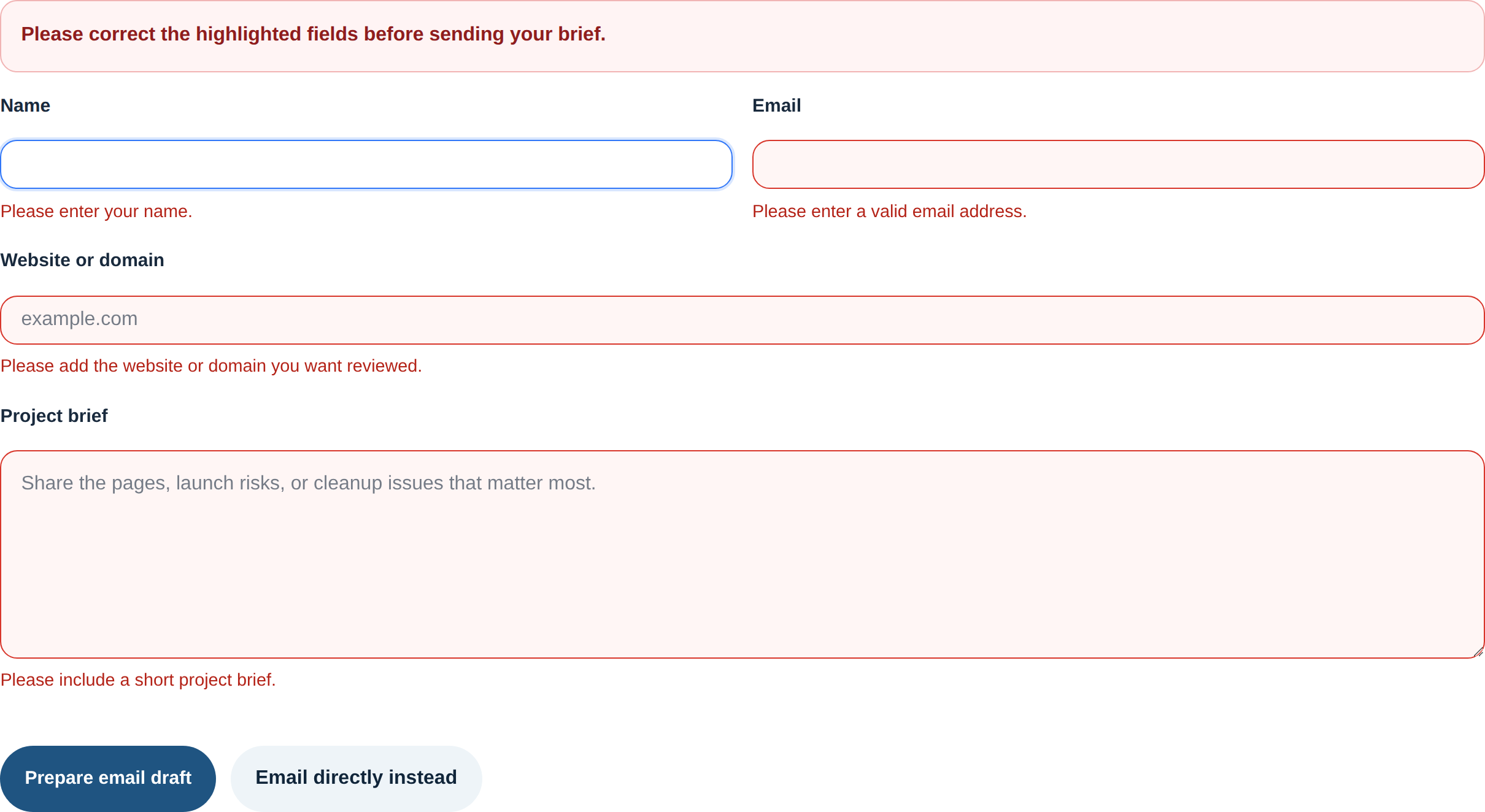
Validation checks: prove both client-side and server-side rules
Client-side validation exists to help the visitor quickly. Server-side validation exists because browsers are not a security boundary and JavaScript is optional from the server’s point of view. You need both.
What to confirm on the client side
- Errors appear near the affected field and explain what to fix.
- Focus moves to the first failing field or summary message in a predictable way.
- Required markers, helper text, and field labels remain visible on mobile and zoomed layouts.
- Conditional logic shows or hides fields without losing previously entered values unexpectedly.
- The submit button reflects progress honestly instead of allowing frantic repeat clicks.
What to confirm on the server side
- Invalid data is still rejected if client-side checks are bypassed or scripts fail.
- Sanitized values are stored cleanly and safely in the destination system.
- Error responses remain understandable if the backend rejects the request.
- Success depends on the backend action actually completing, not just on the frontend assuming success.
A simple validation review table keeps this honest:
| Rule | Client-side check | Server-side check | Pass criteria |
|---|---|---|---|
| Email format | Inline message for invalid structure | Reject malformed value before storage or sending | Same rule and same intent on both layers |
| Required message field | Blocks empty submit | Rejects missing or whitespace-only content | No silent acceptance of empty submissions |
| Phone or postcode pattern | Allows realistic formats used by real visitors | Normalizes or rejects clearly invalid values | Validation supports the business, not the other way around |
When possible, inspect at least one stored submission or admin-side result after a pass. That is where mismatches show up: a frontend accepts one format, the backend strips it, and the sales team receives a partial lead record with just enough detail to waste time.
Submission reliability: test slow network, repeat clicks, and timeout behavior
A form can be logically correct and still fail under realistic conditions. Reliability testing is where you stop assuming that everyone submits from a fast desktop connection with infinite patience.
- Slow network: confirm the form shows progress, avoids duplicate submissions, and eventually resolves to a clear state.
- Double-click submit: make sure one action creates one submission, not two.
- Back and refresh: test whether entered values persist appropriately and whether resubmission warnings are handled cleanly.
- Session timeout: if the form depends on login or a token, verify the user gets a recoverable error instead of losing the entire entry.
- Browser interruptions: open the form in one tab, delay, then submit after a period of inactivity.
I like using a small pass or fail matrix here:
| Scenario | Expected result | Failure worth escalating |
|---|---|---|
| Slow submit | Loading state plus one clear final outcome | Endless spinner or duplicate lead record |
| Refresh after submit | No accidental duplicate submission | Second record created without warning |
| Expired session | User can re-authenticate or retry without confusion | Data loss with no recovery path |
These are not rare problems. They are standard post-update failures because performance, session handling, and anti-spam logic often change in different parts of the stack at different times.
Spam and abuse defenses: test them without punishing real users
Spam controls deserve their own QA pass because they fail in two directions: they let junk through, or they block legitimate users. Both are operational costs.
If the form uses CAPTCHA or bot scoring, review the relevant implementation notes from the provider, such as Google’s reCAPTCHA display documentation, then test the live behavior on desktop and mobile.
- Does the challenge appear when expected?
- Can a real user recover from a failed challenge without starting over?
- Do privacy, browser, or script-blocking conditions break the flow completely?
- Does rate limiting protect the form without locking out legitimate repeated attempts?
False positives matter. If a real prospect with a VPN, strict browser settings, or a corporate network cannot submit a lead form, the system has become overconfident. Machines are good at that.
File upload checks: types, limits, scanning, and message quality
If any form accepts files, raise the QA standard immediately. Upload handling introduces security, storage, and delivery risk at the same time. The OWASP file upload cheat sheet is a useful reference for what the backend should be guarding against.
| Upload test | What to verify | Good outcome |
|---|---|---|
| Allowed type | Common valid file uploads | File attaches successfully and is traceable in the destination system |
| Blocked type | Executable or unsupported file | Upload is rejected with a clear explanation |
| Size limit | File just under and just over the limit | Boundary is enforced consistently and explained clearly |
| Long filename | Spaces, punctuation, and long names | System stores the file safely without corrupting the submission |
Pay attention to the error copy. “Upload failed” is technically a message, but only in the way a locked door is technically a conversation. The user should know whether the problem is file type, file size, timeout, or something server-side.
Email and CRM routing: confirm delivery, formatting, and ownership
Many form bugs are not form UI bugs. They are routing bugs. The form looks healthy; the destination is wrong, incomplete, or empty.
For each high-priority form, verify:
- The destination inbox, CRM pipeline, or support queue is still correct.
- The subject line and message body contain the fields the receiving team actually needs.
- Attachments arrive when expected and remain associated with the correct record.
- Autoresponders or confirmation emails send only when they should.
- Multiple recipients, CC rules, or workflow automations still fire after the site change.
Open the receiving system while testing. Do not trust only the public message. Watch the lead record appear, confirm field mapping, and check whether names, phone numbers, and long text survived intact. That is the difference between a usable handoff and a pretty button.
User feedback and accessibility: make success and failure understandable
Good form feedback reduces support load because it tells the visitor what happened, what failed, and what to do next. Accessibility is part of that outcome, not a separate afterthought.
- Each field needs a real label, not placeholder-only guesswork.
- Error text should identify the field and the fix in plain language.
- Success messages should explain the next step: response timing, confirmation email, or fallback contact path.
- Keyboard users should be able to reach, complete, and submit the form without traps or hidden focus states.
- Screen reader users should hear error and status messages at the right time.
- Color cannot be the only indicator for failure or success.
A quick accessibility pass catches more than many teams expect. Complete one full run without a mouse. Complete another at high zoom on a phone-sized viewport. If error text disappears, labels detach from fields, or the submit button hides beneath sticky interface elements, you found a real release blocker.
A practical form QA checklist before you call the site ready
- Inventory every form, including hidden, embedded, and device-specific variants.
- Document the destination, owner, and expected confirmation behavior for each one.
- Run happy-path, negative-path, and messy real-world input tests.
- Verify client-side and server-side validation separately.
- Test slow network, repeat clicks, refresh, and timeout behavior.
- Check spam controls for both abuse prevention and false positives.
- Test file uploads for allowed types, blocked types, size limits, and useful error copy.
- Confirm email or CRM routing with at least one observed successful submission.
- Run one keyboard-only pass and one mobile pass.
- Log unresolved issues with severity, reproduction steps, owner, and go or no-go impact.
Conclusion: test the handoff, not just the page
The strategic point is simple. A form is part of your operating system, not a decoration on top of the site. If the page looks fine but the submission path is weak, the business still pays for the failure through missed leads, confused customers, and support cleanup.
Start with the forms that carry the highest operational cost if they fail. Audit the path, simplify the rules where possible, and verify the destination with evidence instead of optimism. If you want a broader review framework, the rest of the blog covers adjacent launch and cleanup checks, and the contact page is there when you need another pair of eyes on the decision points.