Most post-update UX bugs are not dramatic. They are tiny gremlins in sensible shoes: the menu label that means nothing, the form that scolds without helping, the page that shrugs and offers no next step. Small problem, big trust leak.
People usually land on an article like this with a very practical set of questions:
- Why did the site look fine in staging but feel awkward the second real visitors touched it?
- How do I check navigation, internal links, and search without turning the review into a week-long archaeology dig?
- What makes a form feel reliable instead of fussy, fragile, or vaguely haunted?
- How do I find dead ends before visitors quietly leave and take their conversion with them?
Steve Krug gave UX its most useful four-word pep talk: “Don’t make me think.” That rule ages well because visitors are not grading your intent. They are grading the friction.
That friction shows up in very measurable ways. Google Search Console makes broken pages and indexing issues painfully visible, PageSpeed Insights exposes slow-loading and layout-shift trouble, and WebAIM’s accessibility checklist is an excellent reminder that “works on my laptop” is not a quality standard. If you are updating a site and want less chaos, UX cleanup is not decorative polish. It is the boring magic that helps people find information, complete a task, and trust what they just saw.
In this guide, I will walk through a visitor-first cleanup pass for navigation, forms, dead ends, accessibility, performance, and measurement. You will get a practical sanity check, clear pass/fail criteria, a few examples, and a one-afternoon QA checklist you can actually finish.
If you want the wider planning context first, start with the home page, then keep the blog open for companion reads like the backup-to-launch checklist and the SEO planning guide. Those posts cover launch risk; this one is about visitor experience once the lights are already on.
Quick definitions before we touch the wiring
It helps to define the usual suspects before they start pretending to be mysterious.
| Term | What it means in normal language | Why it matters |
|---|---|---|
| Navigation sanity check | A review of labels, menus, page hierarchy, and whether visitors can predict where links will take them | If navigation feels improvised, visitors stop exploring. |
| Validation message | The message a form shows when something is wrong or missing | Bad validation sounds like blame; good validation shows the fix. |
| Dead end | A page or state with no useful next step | Dead ends waste attention you already paid for. |
| Orphan page | A live page with little or no internal linking support | Even good content disappears if nothing points to it. |
| Layout shift | Content jumps while loading because images, banners, or embeds reserve space poorly | It makes the site feel sloppy and causes accidental taps. |
Why UX issues are the first thing visitors notice and the last thing teams test
I see this pattern constantly: teams test pages like objects, but visitors experience flows like stories. That gap is where interface friction sneaks in.
A launch checklist usually asks whether the page loads, whether the content exists, and whether the basic integration still works. All important. But visitors ask different questions:
- Can I tell where to go next in under five seconds?
- Do these labels mean what I expect them to mean?
- If I make a mistake, does the form help me recover?
- If I hit a thin page, empty state, or 404, does the site rescue me or abandon me on the sidewalk?
UX bugs usually live between components, not inside them. The header may be technically correct, the form plugin may be technically active, and the page may technically exist. Meanwhile, the menu opens differently on different templates, the validation messages are vague, and the thank-you page offers all the emotional warmth of a parking receipt.
That is why a visitor-first pass matters. You are not just checking “does it work?” You are checking “does it guide?” Those are cousins, not twins.
Navigation sanity check: labels, hierarchy, and consistent menu behavior
Start with the main navigation because it teaches visitors how to use the rest of the site. If it is messy, every other page has to compensate.
1. Fix labels that sound clever but not useful
Navigation labels should be tiny mental shortcuts, not riddles. “Solutions,” “Explore,” and “Resources” can work, but only if the destination is obvious. If a first-time visitor has to open the menu to decode the menu, the menu has become performance art.
Run this test: show the header to someone for five seconds and ask what they expect under each item. If the guesses are wildly off, rewrite the labels.
| Weak label | Why it causes friction | Stronger alternative |
|---|---|---|
| Start Here | Too vague for returning visitors | Services, Pricing, or About |
| Discover | Does not reveal content type | Blog or Resources |
| Reach Out | Playful, but less scannable in a hurry | Contact |
2. Keep hierarchy boring in the best possible way
Your primary navigation should answer the top visitor jobs. Secondary pages can live deeper. When every item looks equally important, nothing is actually prioritized.
A practical pattern is:
- Primary nav: 4 to 6 items for the main paths.
- Utility nav or footer: legal, support, account, less-frequent links.
- Contextual links inside pages: deeper reading, related services, FAQs.
Use the existing core pages intentionally. The about page should explain who the site serves and how it works. The contact page should be the obvious place to ask for help. The blog should hold the process-heavy explainer content, not random menu overflow.
3. Check consistency across templates
This is where many cleanup passes get ambushed. The home page menu might expand one way, the blog template another, and the mobile header may quietly hide the most important CTA. Review the header and footer on:
- Home
- A standard content page
- A blog post
- The contact flow
- A 404 page
If the navigation behaves differently, ask whether the difference is intentional. If the answer is “I don’t think so,” congratulations, you found the bug.
Search and internal links: make key pages reachable in 1 to 3 clicks
Important content should not require a scavenger hunt and an emotional support breadcrumb.
The 1 to 3 click rule is not sacred law, but it is a useful discipline: your core tasks should be reachable fast from common entry points. That means the home page, key landing pages, related articles, and search results should all work together.
What to audit first
- Top tasks: getting a quote, contacting you, learning what you do, finding pricing or scope clues, reading proof.
- Top pages: home, services, contact, about, blog hub, and any post that already attracts search traffic.
- Internal search: does it find the right pages for obvious queries, or does it behave like a sleepy library clerk?
A simple audit method works well:
- List 10 pages that matter most.
- Start from the home page and count how many clicks it takes to reach each one.
- Repeat from one blog post and from mobile navigation.
- Mark anything over 3 clicks or only reachable by search.
Then add contextual links where they genuinely help. For example, a UX cleanup article should naturally point readers to the restoration-vs-rebuild decision guide if the navigation problems are structural, not cosmetic. That kind of internal linking helps both readers and discovery.
If your team is also prototyping a replacement workflow or internal tool before hardening the live experience, a neutral resource like this web app generator can be useful for testing navigation logic and form steps before they are wired into a production site.
Form reliability: fields, validation messages, error states, and spam-prevention UX
Forms are where a site stops being a brochure and starts acting like software. They deserve better than “submitted somewhere, probably.”
A reliable form does four jobs: it tells people what to enter, prevents obvious mistakes, explains real errors clearly, and confirms success without ambiguity.
1. Clean up the fields
Every field should earn its rent. If you do not need company size, phone number, favorite mythical creature, and mother’s maiden name for a basic inquiry, do not ask for them. Fewer fields usually means fewer opportunities for friction.
Use these field rules:
- Label fields above the input, not only inside as placeholder text.
- Mark optional fields as optional instead of making required fields feel like a trap.
- Match input type to data type: email, phone, URL, date, and number fields should behave appropriately on mobile.
- Group related fields visually so the form reads like a sequence, not a spreadsheet collision.
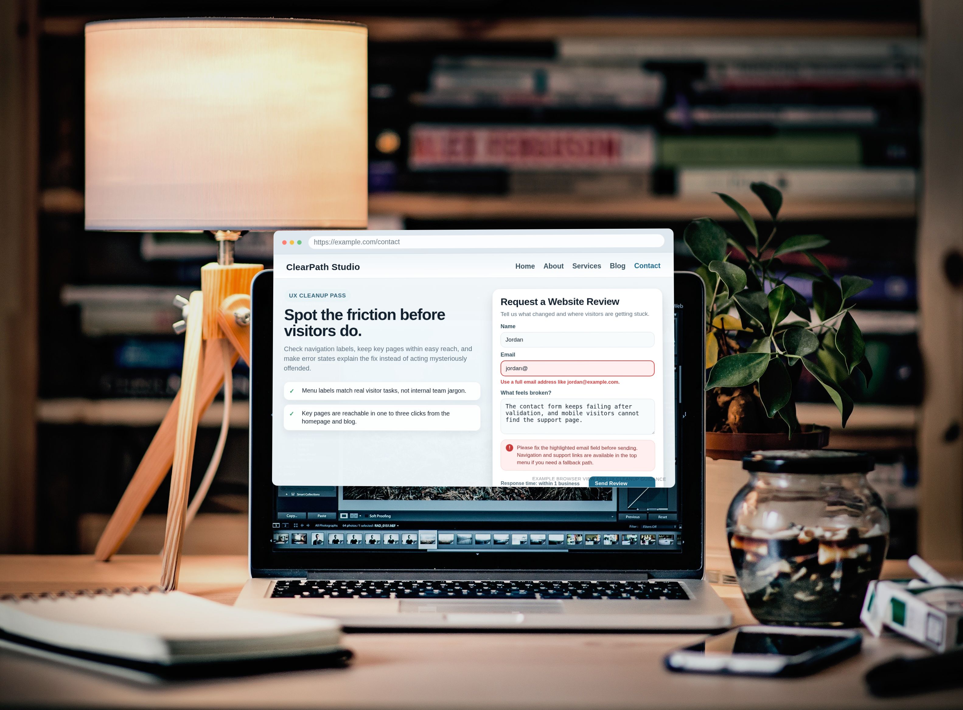
2. Rewrite validation messages like a human
“Invalid input” is not help. It is a shrug in a necktie.
| Bad message | Better message | Why it works |
|---|---|---|
| Field required | Please add your email so we can reply. | It explains the missing item and the reason. |
| Invalid | Use an email format like [email protected]. | It shows the fix instead of only naming the problem. |
| Submission failed | We could not send the form just now. Please try again or email us directly. | It gives a recovery path. |
3. Test the ugly states on purpose
Good teams test the happy path. Better teams also test:
- Missing required fields
- Invalid email addresses
- Long messages
- Slow network conditions on mobile
- Double clicks on the submit button
- Spam or bot-prevention interruptions
One practical example: if CAPTCHA blocks real people more often than bots, the form is “secure” in the same way a locked front door is secure when you also brick over the mailbox. Reduce visible friction where possible. Invisible spam checks, honeypots, rate limits, and clear fallback instructions usually create a better experience than a puzzle box.
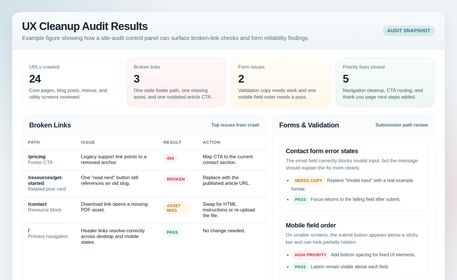
Dead-end prevention: detect 404s, orphan pages, and “no next step” screens
A dead end is any place where a visitor completes one thought and the site offers nothing useful next. It might be a literal 404. It might also be a thank-you page, an empty search result, a retired service page, or a blog post with no related path forward.
Find the obvious dead ends
- 404 pages with no search, no helpful links, and no contact path
- Old URLs still linked internally
- Search results that show nothing without offering a broader category or support path
- Confirmation screens that say “thanks” and then emotionally vanish
Every dead end should offer a next step. That next step might be a related article, a category page, a contact CTA, a search box, or the primary service page. The exact choice depends on visitor intent, but “good luck out there” is not a strategy.
Find the quieter dead ends
These are the sneaky ones:
- Orphan pages with no links from navigation, related posts, or parent pages
- Posts that rank but never route readers toward a conversion path
- Thin utility pages that exist for technical reasons but feel like abandoned hallways
A practical cleanup move is to add one “what next” block near the end of key pages. Not a spammy box. Just a clear bridge: read the related guide, review the services, visit the contact page, or go back to the blog index for deeper reading.
Mobile and accessibility pass: tap targets, focus order, contrast, and keyboard navigation
This step catches a lot of “technically works” failures. On desktop, a cramped menu may be merely annoying. On mobile, it becomes a thumb-wrestling tournament nobody asked for.
Mobile checks worth doing every time
- Buttons and links are large enough to tap without collateral damage.
- Sticky bars do not cover form messages or the submit button.
- The mobile menu closes cleanly and does not trap the screen in an overlay purgatory.
- Form fields trigger the right keyboard type and stay visible while typing.
- Important CTAs appear before the reader’s patience expires.
Accessibility checks that create immediate UX wins
- Focus order: tab through the page and make sure the order follows the visual logic.
- Visible focus states: keyboard users should never lose the cursor in a hedge maze.
- Contrast: pale gray text on a white background is not elegant; it is a secret.
- Labels and instructions: screen reader users and distracted users both benefit from clarity.
- Meaningful alt text: use it when the image supports understanding, not as decorative confetti.
If you want a fast testing stack, use your phone, one desktop browser, one keyboard-only pass, and one accessibility checklist. You do not need a lab to catch the loudest problems. You need intention and twenty focused minutes.
Performance UX basics: avoid layout shifts and slow-loading critical paths
Visitors do not separate “performance” from “experience.” To them, slow is clumsy and jumpy is broken.
The fastest cleanup wins usually come from the boring things:
- Reserve space for images, embeds, and banners so the layout does not jump.
- Compress and size hero images appropriately.
- Delay non-essential scripts and visual extras.
- Load forms and critical CTAs early enough that people do not outrun the interface.
- Test the pages that matter most, not only the prettiest page in the staging deck.
A useful rule is to define a critical path for each high-value page. On a service page, that path might be headline, proof, CTA, and contact method. On a blog post, it might be title, intro, image, internal links, and next-step CTA. If the critical path loads slowly or shifts around, users feel the wobble immediately.
Measurement: what to track in Search Console and analytics to confirm the fixes
Cleanup without measurement is just optimism with nicer formatting.
| Signal | What to look for | What a positive trend means |
|---|---|---|
| 404 and crawl issues | Fewer error pages and cleaner coverage reports | Your dead-end cleanup is working. |
| Internal search usage | Searches becoming more targeted or less necessary for basic tasks | Navigation is clearer. |
| Form completion rate | More successful submissions and fewer abandonments | Form friction has dropped. |
| Click-through to key pages | Better movement from posts to services, contact, or about pages | Your internal linking is doing real work. |
| Engaged sessions or time on key paths | Visitors continue deeper instead of bouncing after confusion | The experience feels more coherent. |
Set alerts for sudden spikes in 404s, submission failures, and major drops on important pages. Quiet failures are expensive because they let bad UX sit in production wearing a fake moustache.
A practical QA checklist you can run in one afternoon
This is the part to steal shamelessly. Pick your top five visitor journeys and run this pass with pass/fail notes.
| Check | Pass if… | Fail if… |
|---|---|---|
| Primary navigation | Labels are clear, menu behavior matches across templates, top tasks are visible | Labels confuse, important pages are buried, or mobile behavior changes unpredictably |
| Internal links and search | Key pages are reachable in 1 to 3 clicks and site search returns useful results | Important content is only reachable through guesswork or not found at all |
| Forms | Fields are clear, validation is useful, submission confirms success, fallback exists | Errors are vague, submit states are unclear, or test messages disappear into the void |
| Dead-end states | 404s, thank-you pages, and empty states all offer a next step | Visitors hit a stop sign with no recovery option |
| Mobile and accessibility | Tap targets work, keyboard order makes sense, contrast is readable | Menus trap focus, text is hard to read, or forms are painful on phones |
| Performance UX | Critical path loads without obvious jumps or sluggish blocking assets | Images shove content around or key actions appear late |
| Measurement | Tracking exists for errors, clicks, and conversions that matter | No one can prove whether the cleanup helped |
If three or more items fail, do not treat the site as “basically done.” That phrase has launched many regrettable Tuesday afternoons.
Final takeaway: less chaos, more direction
UX cleanup after a site update is rarely glamorous, but it is wildly practical. Clear navigation reduces hesitation. Reliable forms reduce drop-off. Strong next steps keep visitors moving instead of leaking away.
If you want to make this article useful immediately, do one small experiment today: open your site on a phone, start from the home page, try to reach the contact path, submit a test form incorrectly once, then recover. That five-minute walkthrough will tell you more than a very confident status meeting.
For a next step, review the about page for positioning clarity, use the contact page as your live form benchmark, and browse the blog for the related launch, SEO, and planning guides. The goal is not perfection in one pass. The goal is less interface friction, fewer dead ends, and a site that feels like it knows where it is going.
Key points at a glance
- Navigation: clear labels and consistent behavior beat clever wording every time.
- Internal linking: key pages should be reachable quickly from common entry points.
- Forms: good validation explains the fix, not just the fault.
- Dead ends: every 404, empty state, and confirmation screen needs a next step.
- Accessibility and mobile: keyboard order, contrast, and tap targets are core UX, not bonus rounds.
- Measurement: track errors, clicks, and conversions so the cleanup can be confirmed, not guessed.
- QA: a one-afternoon pass with real visitor journeys catches more than a page-by-page glance.